
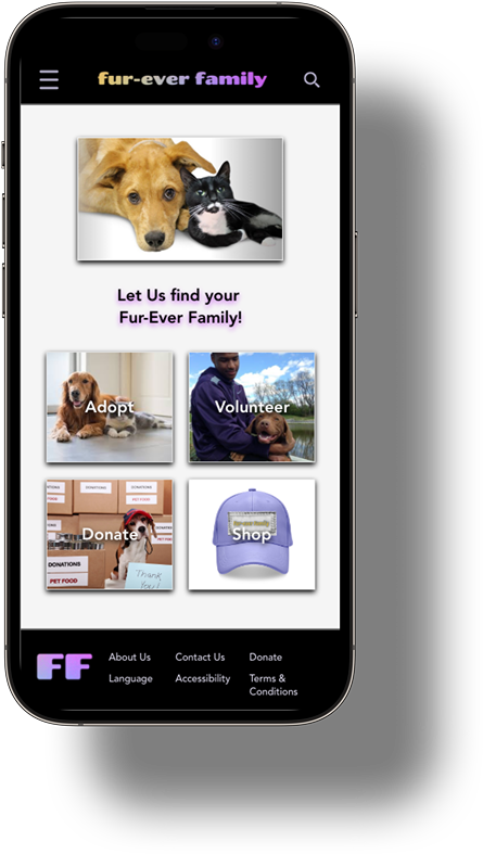
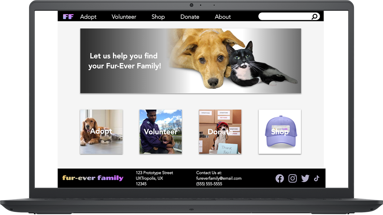
responsive website design


Project overview
-
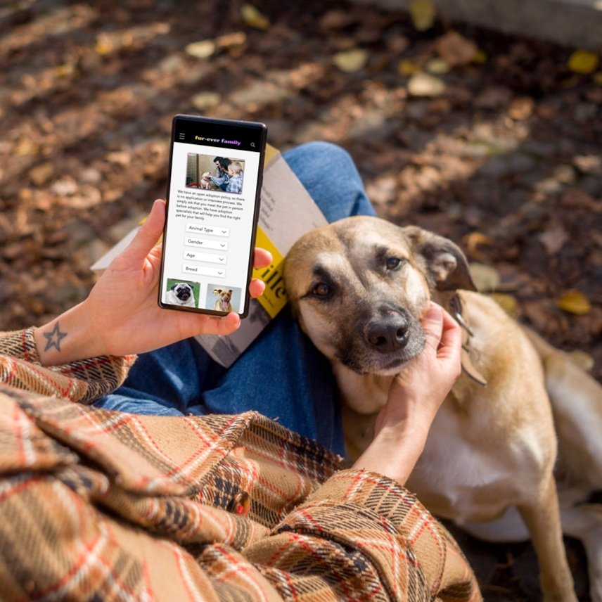
Fur-Ever Family is a responsive website through which animal lovers can sign up for adoptions, fostering, and volunteering opportunities, as well as shop for pet products online.
-
December 2022 - February 2023
-
Animal enthusiasts nationwide are seeking an easy and convenient way of adopting or fostering pets, supporting their local and national pet shelters, and buying supplies for their favorite “fur babies.” Unfortunately, most animal welfare websites lack the necessary information for users to make informed decisions when adopting or fostering a pet. Additionally, these websites do not have a straightforward process for inquiring about animals and their availability. When users are unable to find what they are looking for, they are likely to lose interest in engaging with the site. Considering that animal welfare agencies rely heavily on grants and donations for funding, Fur-ever Family's responsive website needs to offer a user-friendly inquiry process, multiple ways to generate income and provide helpful information about animals.
-
The goal is to offer a responsive website where pet lovers can access information on pets available for adoption, book appointments to meet/adopt these animals, and contribute to the shelter through donations, volunteer sign-ups, and merchandise purchases - all via the website.
-
UX Researcher & Designer responsible for user research, usability study moderator, wireframing, prototyping, and mockups from concept to completion.
Empathize Phase

User Research
-
To understand the challenges of searching for a pet online, an initial screener survey was sent out to a representative sample of 10-15 diverse users who had adopted a pet through a shelter or an animal adoption agency. It became evident that many users lacked trust in using technology for finding an animal; instead, they preferred visiting a shelter in person. The insights gained from their responses guided my design process by highlighting the pain points. In addition to the survey, I conducted a competitive audit and independent research on various websites, which informed the direction I wanted to take with the user interface of the website. Following the creation of digital wireframes and a low-fidelity prototype, I carried out a usability study to assess the effectiveness of my product's UI and overall user experience on the site. Leveraging the data collected from this study, I iterated on my designs and developed mockups that aim to assist users in fostering and adopting a pet, making donations, volunteering at local shelters, and purchasing pet supplies through a website.
-
~Users want to know about a pet’s breed - Users tended to trust breeders with information about their pets over animal shelters, but acquiring a dog from a breeder can be pricey, and harmful to pets (e.g. puppy mills, stolen dogs being sold, etc.)
~Pet adoption sites can be inaccurate - When looking for pets online, it can be frustrating if the website does not provide real-time updates. Our users want to know which pets are currently available and where they are located.
~User Experience - People are interested in supporting animal shelters by either adopting or donating money and supplies, yet they often only interact with the organizations when they go through the adoption procedure. The majority of users did not feel involved or devoted to a certain agency.
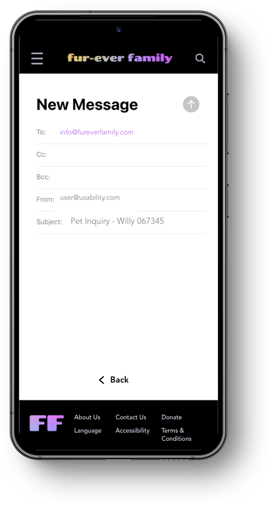
~Real-time Communication - Our users need a means to effectively inquire about the pets and engage with the shelter via the website, in real-time. Additionally, our users expect swift and precise responses. justified.
-
Layla Kaveh represents the busy adult/parent who wants to make their children happy, have a family pet and/or companion, and do something good for the community, all while making the most informed decision that they can.
-
I wanted the responsive website to be highly informative, while also allowing the user to easily search for something they may have missed. For the user journey map, I have included information about our persona, Layla, who is searching for a specific pet and is interested in supporting her local shelter, in case she doesn't find a suitable pet for her home. My user journey map identifies potential areas of frustration and gaps that can be addressed with improved user support.
-
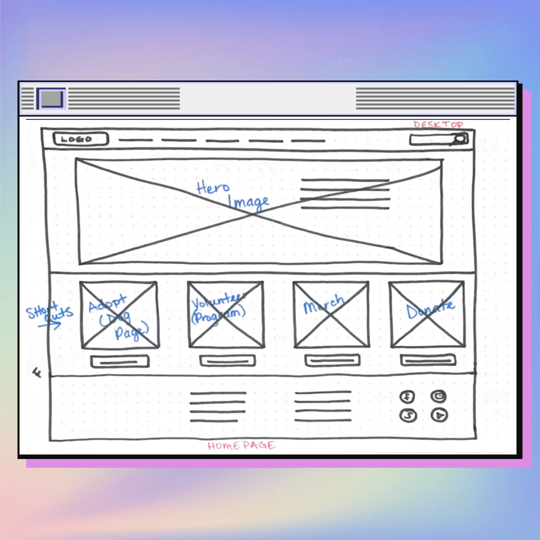
In my initial sitemap, I organized the website navigation just beneath the homepage, at the top of my hierarchy, so that users can immediately see that their concerns will be resolved upon initial view.
Define Phase


starting the design
-
Making sure that my site was easy to read and navigate, was my first priority. My primary objective, while drawing these sketches, was to be concise and effective in leading the user through the flow.
I looked at other websites that were clean and simple and attempted to replicate that style so that the user wouldn’t feel lost or overwhelmed.
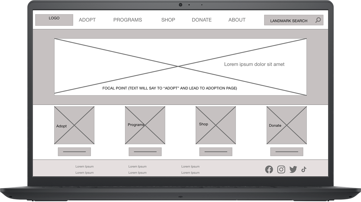
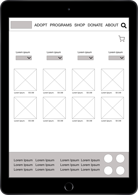
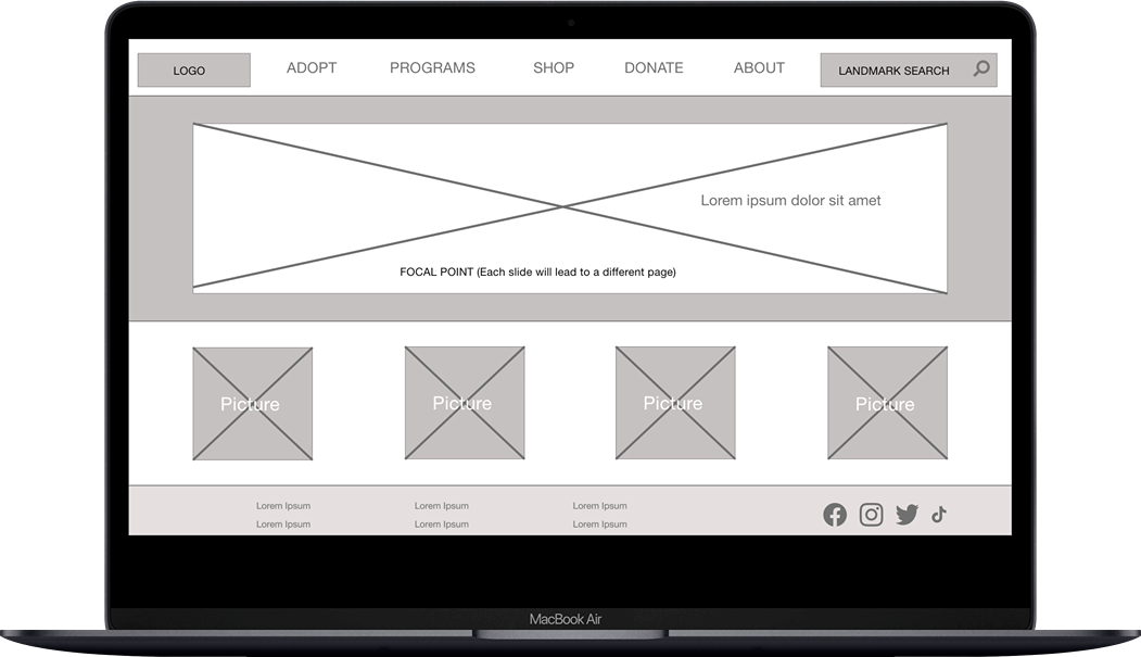
I started with the desktop wireframes first. It was my goal to understand navigation using only pictures. If the user could understand what to do with pictures and visuals only, the flow would only improve with text.
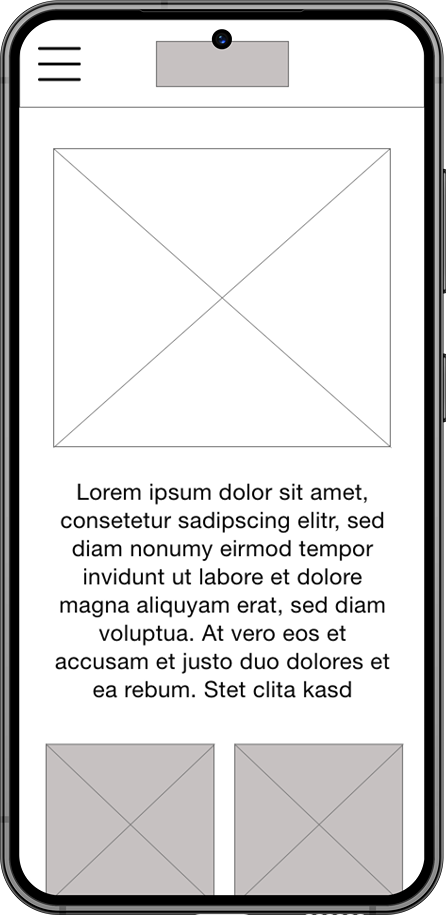
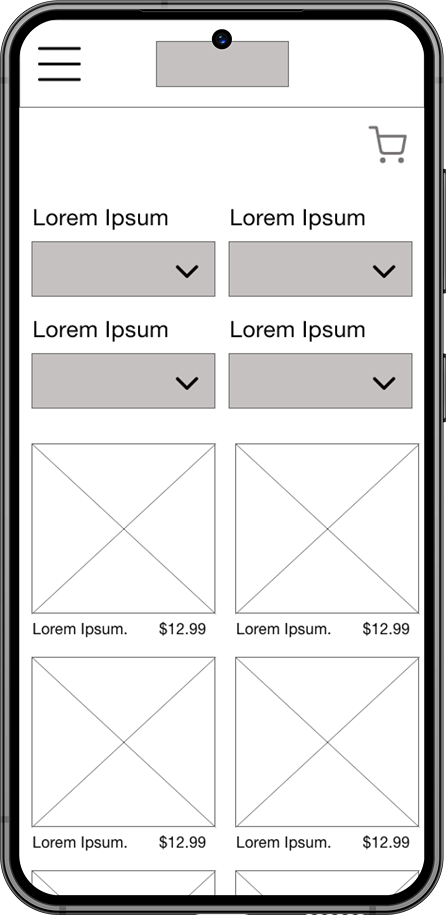
I made the mobile/tablet variations with the same simplicity as the desktop wireframe.
-
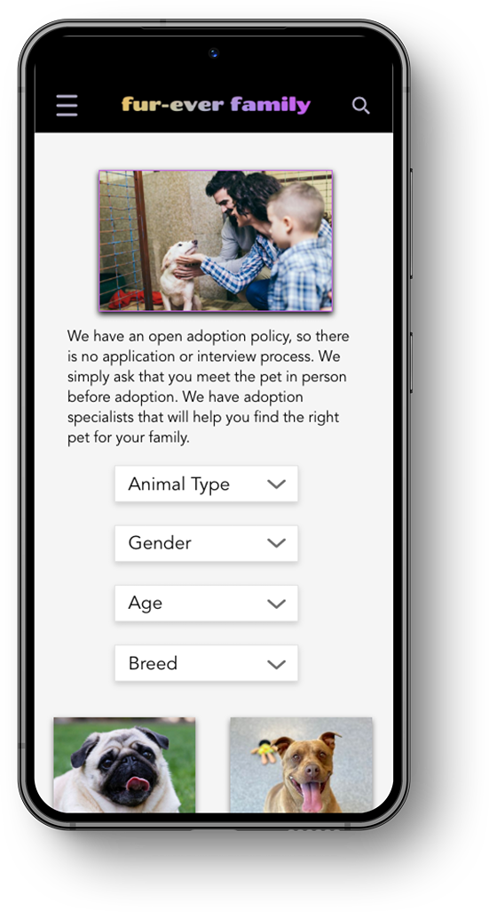
At its core, my users expressed a desire for comprehensive knowledge about the animals available for adoption and an understanding of how they could assist homeless pets even if they were unable to adopt them. To cater to these requirements, I incorporated diverse strategies, such as integrating buttons that mirror the navigation menu options and implementing a search functionality for effortless access to relevant information.
My goal was not only to ensure consistency in the overall screen variations but also to create cohesion among the screens within each variation. To achieve this, I incorporated a common theme on every page, which included using a hero image to introduce the content of that specific page. This approach provides users with a visual representation that aligns with the given inputs.
-
-
~Parameters - I conducted a moderated usability study in Oklahoma City, which included in-person sessions as well as remote participation via Zoom. I provided guidance to 5 participants, instructing them to navigate the low-fidelity prototype on their preferred device. All the connections remained stable throughout the study.
~Findings - Every user opted for the website's top-of-the-screen navigation menu rather than the inset buttons because the buttons lacked labels. A few participants did not consider the term "Programs" self-explanatory enough to infer that the link led to volunteering opportunities. And Some users were unsure about how to navigate back to the home screen. They didn't consider clicking on the square icon located at the top of the screen. This observation led me to the conclusion that text is necessary for understanding wireframes.
Ideate & Design Phase


Testing and redefining the design
-
Scalability is a crucial aspect of design and this project taught me all about that! I adapted each element to accommodate different devices that the users may utilize, ensuring a seamless user experience across various screen sizes.
In addition, I made the language and typography inclusive of non-English speakers to increase accessibility and inclusivity. By choosing fonts that were easy to read and comprehend, I created an inclusive environment for all users, regardless of their language proficiency.
And lastly, I changed the color scheme to a more contrasting style with pops of aesthetically pleasing colors as an effective way to enhance visual appeal. A well-balanced contrast can improve readability and make key elements stand out, while the pops of colors add visual interest and create a sense of dynamism.
Overall, by focusing on scalability, inclusive typography, and an appealing color scheme, you are taking important steps toward creating a user-friendly and visually captivating design.
-
-
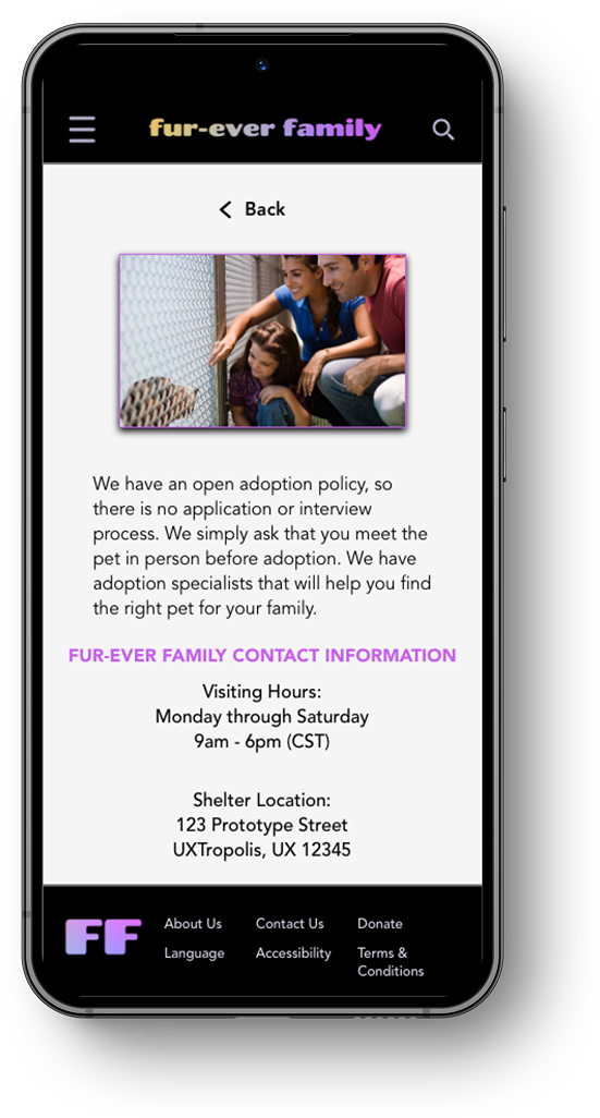
~It was essential to ensure that every button or picture link includes text to provide users with clear information about the destination and purpose of their click.
~I implemented a typography hierarchy to organize the titles and navigation of the website. This ensured that our users could easily navigate through the site. The navigation menu and hero images on each screen are displayed with a larger font size, providing an intuitive guide for our users.
~At first, I chose a website design with blue and yellow tones. However, after thinking about accessibility, I realized some changes were necessary. I decided to switch to a color scheme of white, black, and lilac to improve contrast and give the website a more polished look.
Testing Phase
Before Usability Study
After Usability Study

Before Usability Study
After Usability Study


Before Usability Study
After Usability Study

Before Usability Study
After Usability Study


Before Usability Study
After Usability Study


Before Usability Study
After Usability Study
Main user flow through the adoption inquiry process
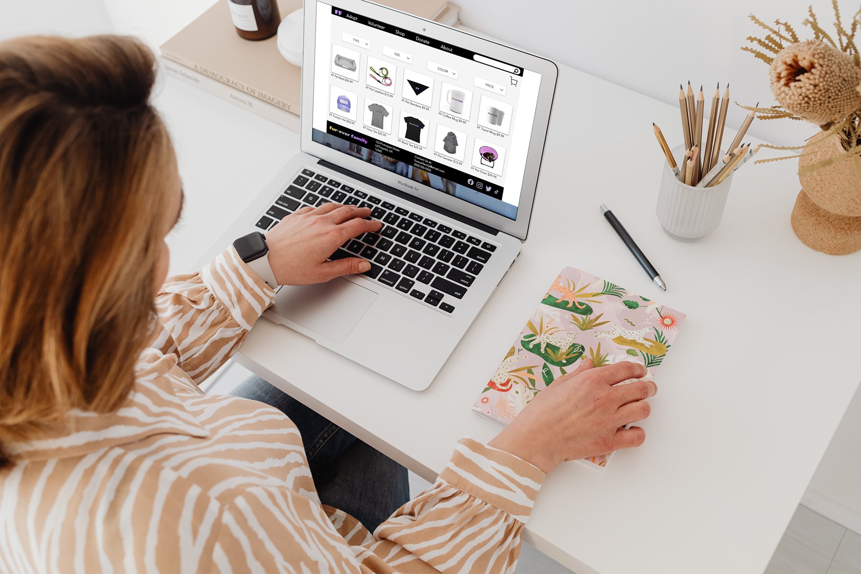
Mockups


Let’s learn together


-
~Impact - Based on feedback from my usability participants, it was noted that they appreciated the clean color palette and the user-friendly navigation throughout the entire site. And instead of having to guess where to go or what each button does, every button and picture was clearly labeled, making the user experience more guided and less confusing.
~What I’ve Learned - Through this project, I have gained valuable insights into the importance of scalability, legibility, and color choice. I have been continuously improving my research skills by conducting thorough usability studies and surveys. This has helped me in creating a user-friendly and efficient responsive website. By adopting a "mobile-first" approach, I learned which devices are more popular among a wider audience and how to optimize content for each device accordingly.
-
~Implement more accessibility features like text-to-speech, language, and hands-free ordering through a microphone.
~Conduct additional usability studies, and/or app surveys, and implement the feedback.
~Add a GPS navigation feature so that users can find service providers in real-time.
In loving memory of Reeses Aranda
2016-2021
