Mobile Application and Responsive Web Design
Project Overview
-
Volonté is a mobile application and responsive website where users can find and schedule community services in their local area, donate to nonprofits, and connect with like-minded individuals who share an interest in helping their communities. The app is designed as a social platform where users can engage with other volunteers and redeem "impact points" in exchange for small gifts, such as a coffee or an item valued below $25. The responsive website is designed to provide information and direct users to download the mobile app.
-
April 2023 - August 2023
-
Many communities face significant challenges when it comes to limited resources and manpower. These struggles can make it difficult for them to effectively address their needs and fulfill their goals. Loneliness and depression have unfortunately reached significant levels in many societies, largely attributed to the global pandemic and the increasing political divisions. The collective impact of these factors has led to a peak in feelings of isolation and emotional distress among individuals.
When researching the reasons why community members are not more involved in social change, I found that the factors varied. Some individuals cited tiredness and exhaustion as barriers, while others expressed a lack of knowledge on how to get involved or where to begin. Ultimately, the challenge lies in creating a platform that effectively delivers knowledge to the user and fosters a social space where they can engage and participate to the extent that volunteering becomes a part of their daily lives.
-
Community engagement plays a crucial role in increasing the visibility and understanding of various issues. It empowers communities to actively participate in decision-making processes that directly impact their lives and environment. Additionally, it is important to acknowledge that humans rely on one another to not only survive but also thrive. The Volonté mobile application and responsive website aim to create a positive and accessible space for people to engage with one another while serving their community. In addition, the product offers features that enhance daily usage and encourage increased activity.
-
~Role - UX Designer, UX Researcher leading the app and responsive web design from concept to delivery.
~Responsabilities - Conducting interviews, paper and digital wireframing, low and high-fidelity prototyping, conducting usability studies, accounting for accessibility, iterating on designs, determining information architecture, and responsive design.
Empathize Phase
User Research
-
I utilized internet data on community service to create questions for a screener survey. In this survey, I carefully selected a representative sample of 10-15 diverse users. My questions covered a range of topics, including the frequency of participants' engagement in community service, their favorite apps, and how they socialize with their friends. I wanted to assess whether the participants' social life primarily revolved around social media or in-person interactions. Additionally, I aimed to gauge their level of involvement in their respective communities. Most interview participants reported feeling bad about not participating in any volunteer work, but they did not actively seek ways to serve. Additionally, I conducted a competitive audit of three direct competitor apps or websites that are directly involved in helping non-profit organizations, as well as two indirect non-profits that actively recruit community members to get involved in serving. By analyzing the challenges identified in the user pain points from the screener survey and the competitive audit report, I was able to compile my findings into problem statements, personas, and ultimately formulate goals and solutions.
Based on my user research, I had to develop distinct goals for each platform. This approach ensures that the objectives align with the specific needs and preferences of users on each platform. It became clear that each platform had to serve a distinct purpose while still being interconnected enough to support each other's objectives.
-
~Awareness - The majority of users did not consider volunteering initially, let alone downloading an app for that specific purpose. Many volunteer apps or websites lacked information about how to serve, specific dates and times for volunteering, and a range of options for volunteering.
~Time - Some of the users claimed to be tired from their daily stresses and have expressed difficulty in finding time or alternative ways to serve their community.
~Lonliness - Most users have reported spending more time on social media than they intended to, but they feel that it is one of the few ways to maintain a connection with the real world when they are at home. The majority of them also expressed that they were unsure of how to meet new friends outside of their workplace or places of worship.
~Buy-in - Some participants, who were already active in their communities, felt that they faced challenges in persuading their peers to volunteer with them. They expressed a lack of methods to make community service appealing to others.
-
Aaliyeah Hashemi represents a parent, an activist, and a concerned community member who aims to actively serve her community while also leading her family in philanthropic endeavors. She represents people who have a desire to serve, but need information on where to start.
-
Adeel Korai, a busy medical student who is new to the United States, represents individuals who have a desire to connect with others in their community but may face challenges in physically volunteering or lack transportation. In such situations, there is a need for digital engagement opportunities. Adeel, who represents the NBU, may not have access to a smart device and needs to access technology through websites.
Define Phase
starting the design
-
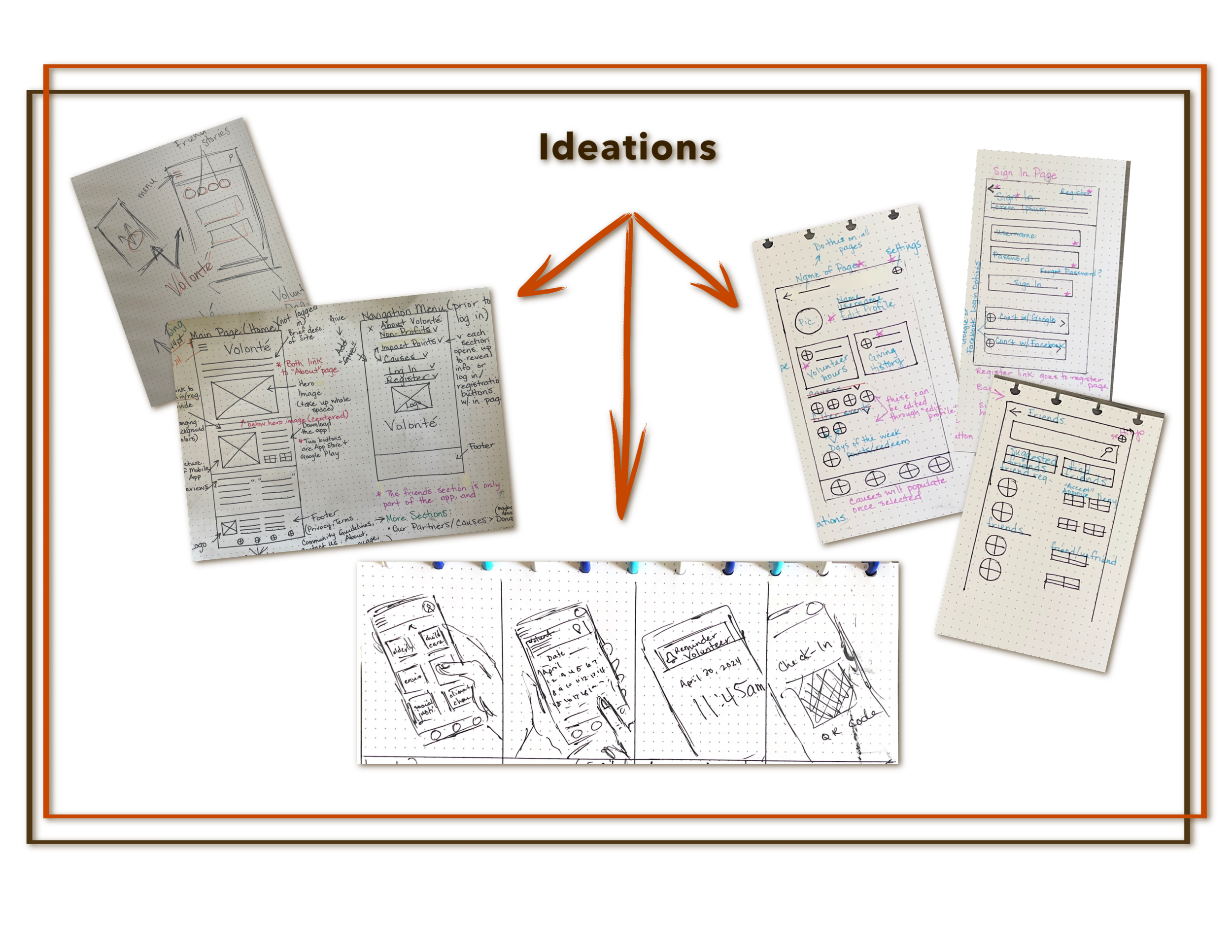
To generate solutions for the identified research gaps, I engaged in some useful techniques like Crazy 8s and paper sketches. These ideation exercises helped me think creatively and come up with innovative ideas to address the gaps effectively.
When creating my sketches, my goal was to convey a visually captivating experience similar to that of social media. I aimed to instantly grab the users' attention through vibrant and appealing visuals. In addition, it was important for me to establish a clear and well-defined user flow, ensuring a smooth and intuitive navigation throughout the interface.
-
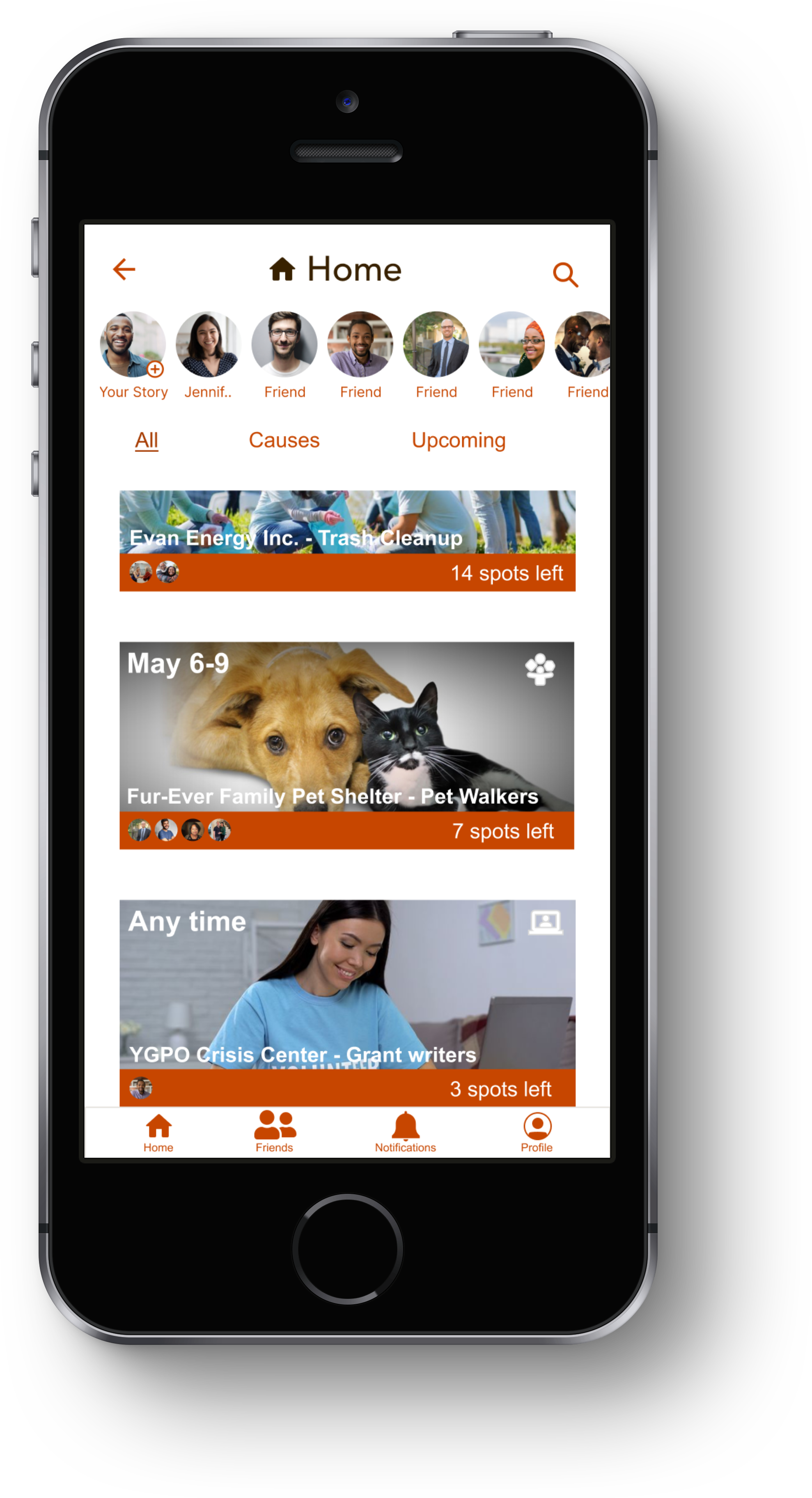
Once I had brainstormed and created paper wireframes, I moved on to developing the initial designs for the Volonté app. The main objective of these designs was to showcase a wide range of volunteer opportunities available to users, while also providing guidance on how they can easily schedule their community service hours.
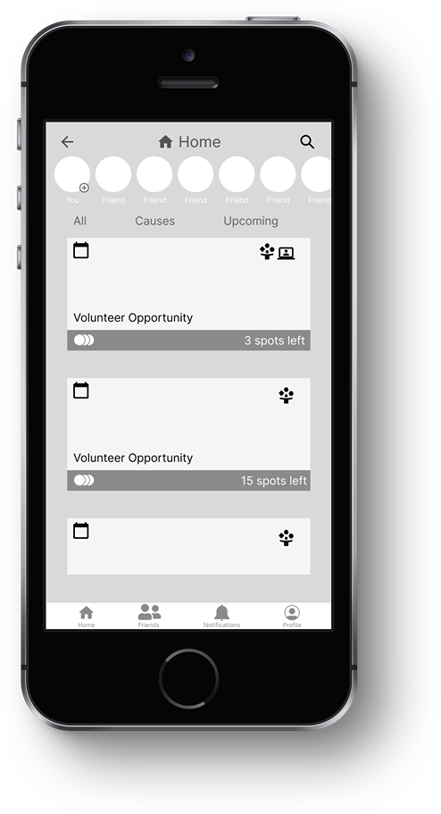
In this context, the image boxes serve as visual representations of volunteer opportunities offered by various non-profit organizations. The icons placed at the top of each box represent important details such as the volunteering date(s) and whether the event will be held in person or virtually. This visual aid helps individuals effectively manage their schedules and make informed decisions about which opportunities they'd like to participate in.
To create a sense of excitement and encourage participation, I felt it to be beneficial to include bottom icons (on each volunteer opportunity) that represent the users' friends (through the app) who have volunteered with that specific non-profit organization. These icons can also display the number of available volunteering spots left. By visually showcasing friends who have already contributed, potential participants can feel motivated to join in and contribute alongside their peers.
-
Click here for Low-fidelity prototype - I was looking for an app that was easy to use, yet engaging. I wanted the user to feel supported and guided throughout the entire experience.
-
~Parameters
Type - Moderated Usability Study
Location - Oklahoma City, OK and remote via Zoom
Participants - 8
Length - 30-60 minutes
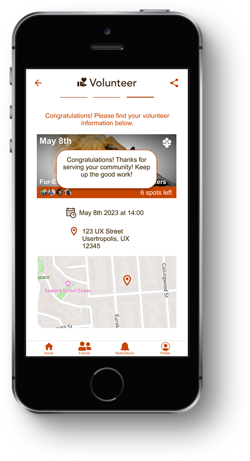
~Findings - Some users were not aware if they had successfully signed up to volunteer or not. To address the issue, a separate prompt was implemented. This additional prompt is designed to clearly show users that their sign-up was successful. This helps to ensure that volunteers have peace of mind and can confidently proceed with their commitment.
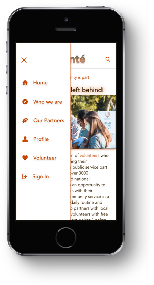
During the usability study, all users navigated to the homepage in search of the logout button on the prototype. Considering this consistent behavior, it would be advisable to place the logout icon either on the profile page, homepage, or within the navigation menu for easy accessibility.
According to user behavior, it was observed that a majority of users repeatedly returned to the home screen to carry out various tasks. To address this pattern, I felt it necessary to enhance the home screen by incorporating additional features and functionalities.
Ideate & Design Phase
Testing and redefining the design
-
To make the app visually attractive and welcoming, I opted for pictures of individuals actively participating in volunteer work instead of using non-profit logos or branding. Additionally, I chose a white background to create a clear contrast and enhance usability.
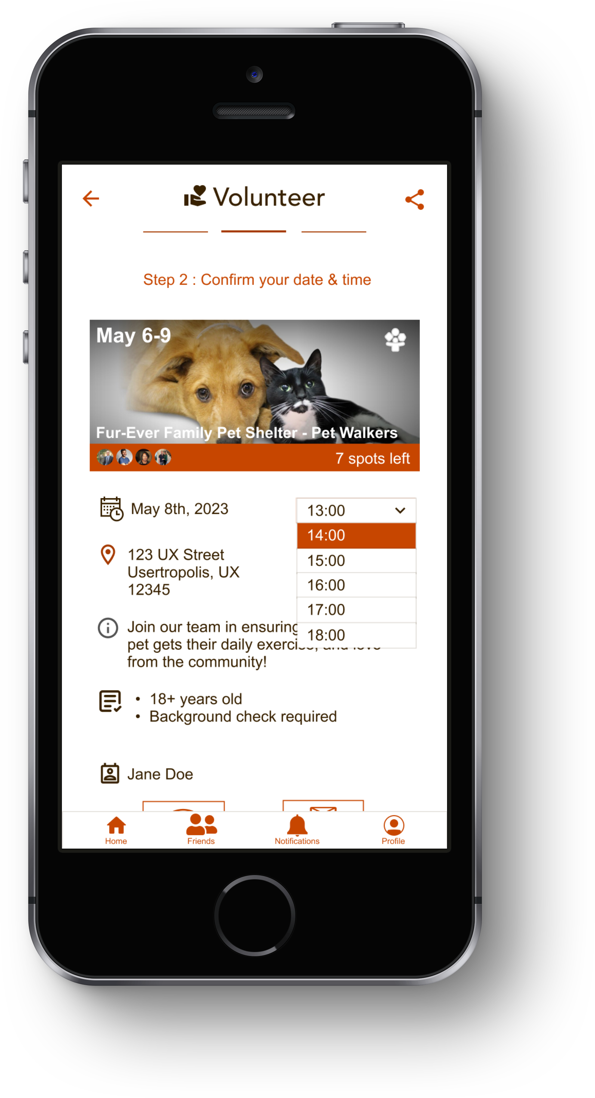
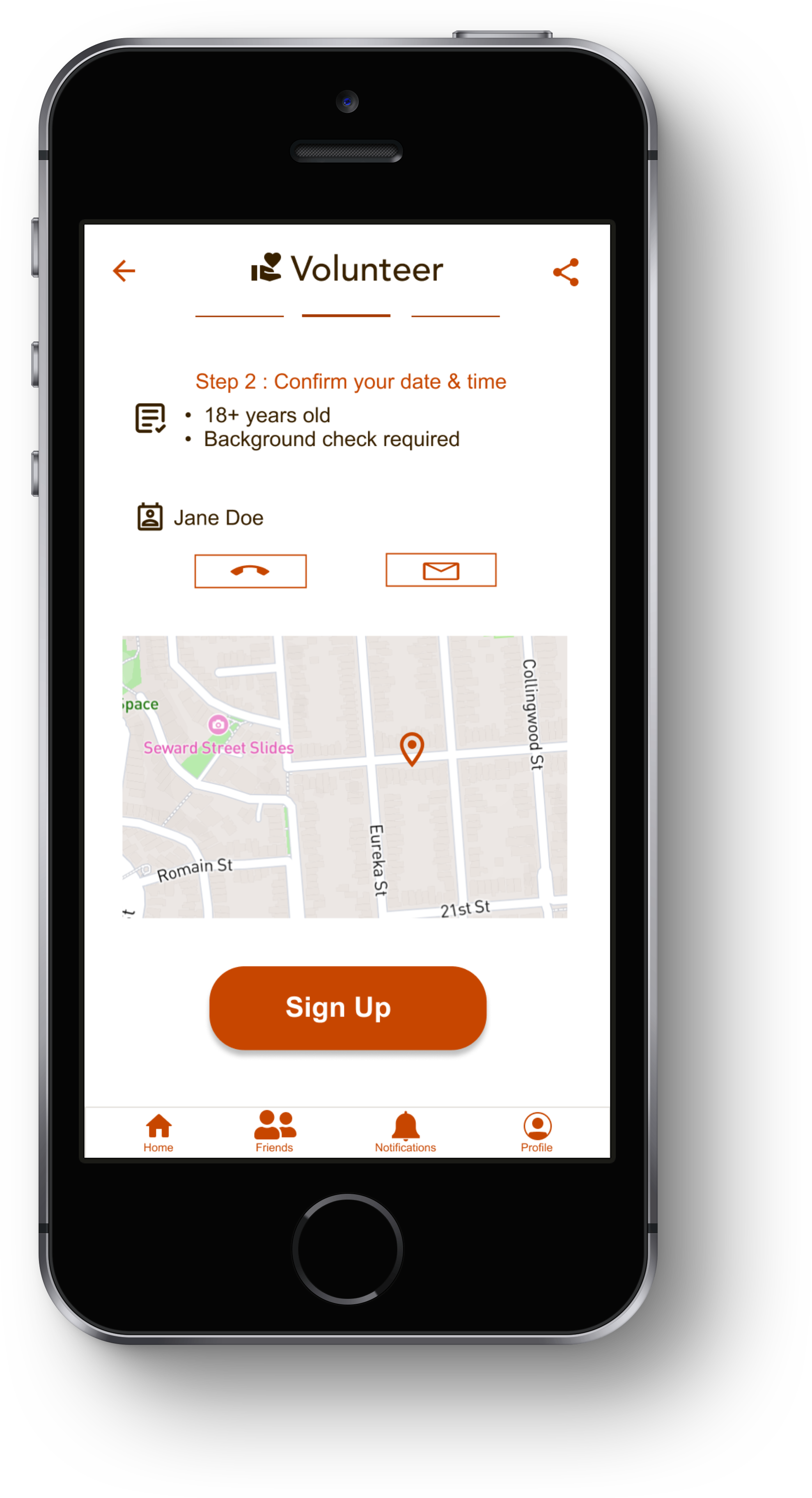
Furthermore, I implemented clear and user-friendly steps at the top of the volunteering screen(s) to assist users in signing up effortlessly. To enhance usability, intuitive icons, and concise text were incorporated to provide seamless guidance throughout the process.
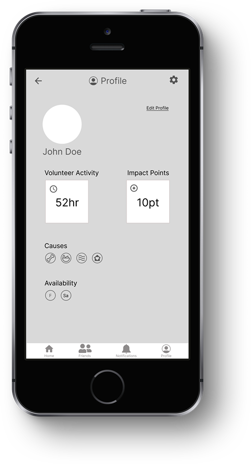
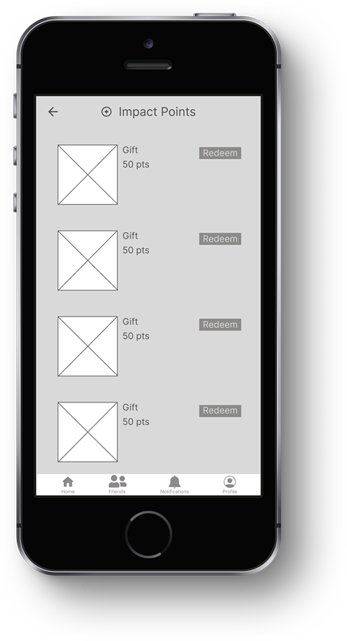
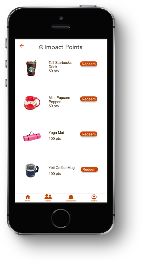
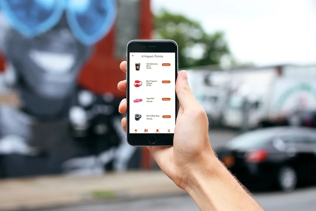
To encourage more volunteering and provide an added incentive, I implemented a feature called "Impact Points." This feature rewards users with points upon successful completion of their community services. By earning these points, users can track and showcase their impact within the community. Once users have earned a significant number of points, they can exchange them for various items worth less than $25. These rewards can include anything from a cup of coffee to a yoga mat or even a tumbler. This incentivizes users to keep engaging with the app, by accumulating more points or redeeming their well-deserved rewards.
-
For a high-fidelity prototype, click here.
My goal was to develop a user-friendly and welcoming experience that would encourage users to engage with the content.
-
~Color Choices - The Volonté app is designed with colors that meet the requirements of the Web Content Accessibility Guidelines (WCAG) contrast ratio tester. This ensures that the colors used in the app are accessible to individuals with visual impairments or color blindness, allowing everyone to use the app without any difficulty.
~Language and Typography - I designed the app with user-friendliness in mind. I have incorporated hierarchical headers to provide clear guidance to the users. The text within the app is written in a straightforward manner, making it easy for users to understand and follow along.
~Iconography - In order to enhance usability for foreign language users, all text is supplemented with appropriate iconography. These icons help users understand and follow prompts more intuitively, ensuring a smoother and more user-friendly experience.
Testing Phase
Before Usability Study
After Usability Study
Before Usability Study
After Usability Study
Before Usability Study
After Usability Study
Before Usability Study
After Usability Study
Main user flow on app (log in, find volunteer opportunity, and sign up)
Mockups
Responsive Website Design
-
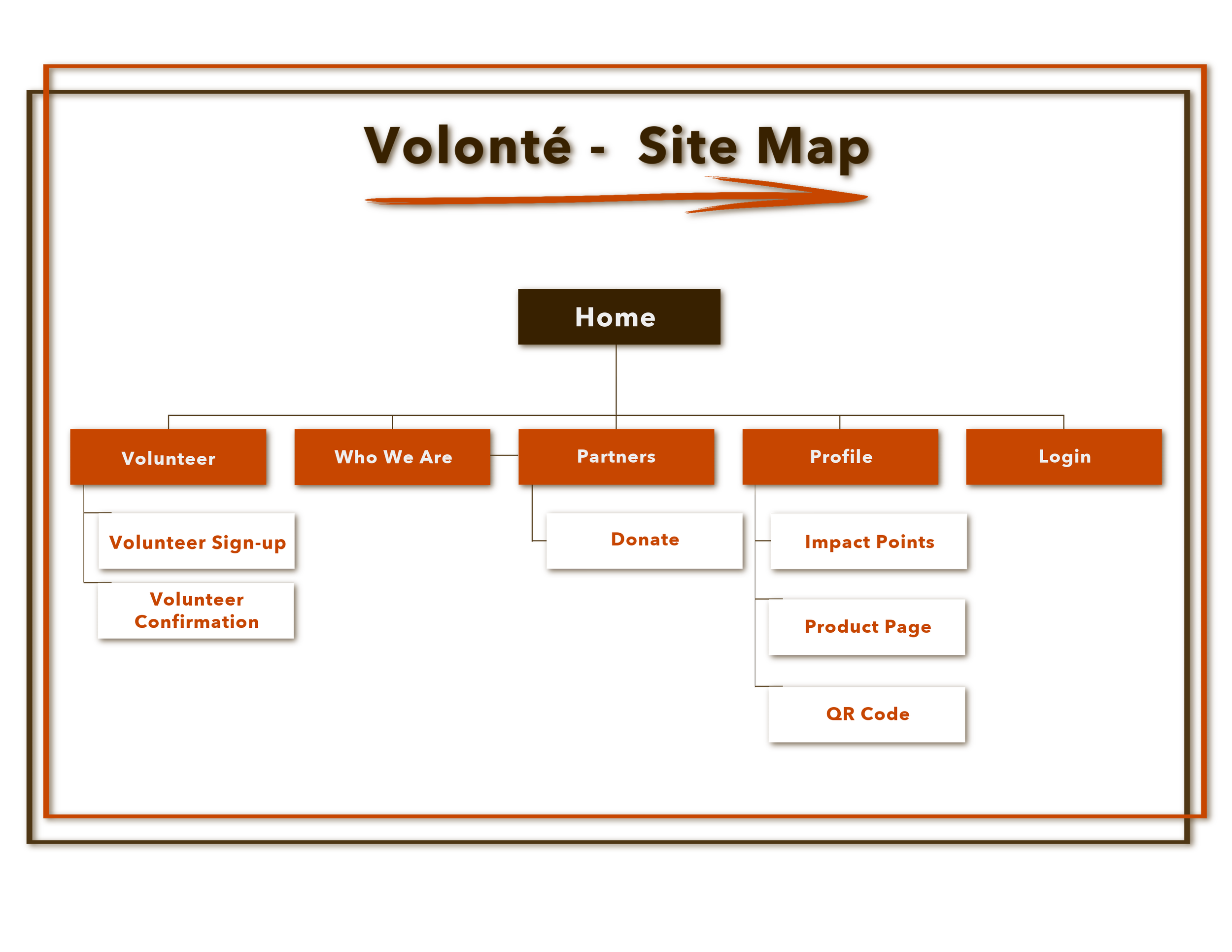
Site Map - The purpose of the Volonté app is to provide a convenient platform for users to participate in community service activities. It not only encourages social responsibility but also fosters connections and enjoyable experiences, allowing users to make friends while making a positive impact on their communities.
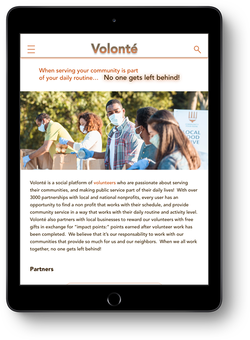
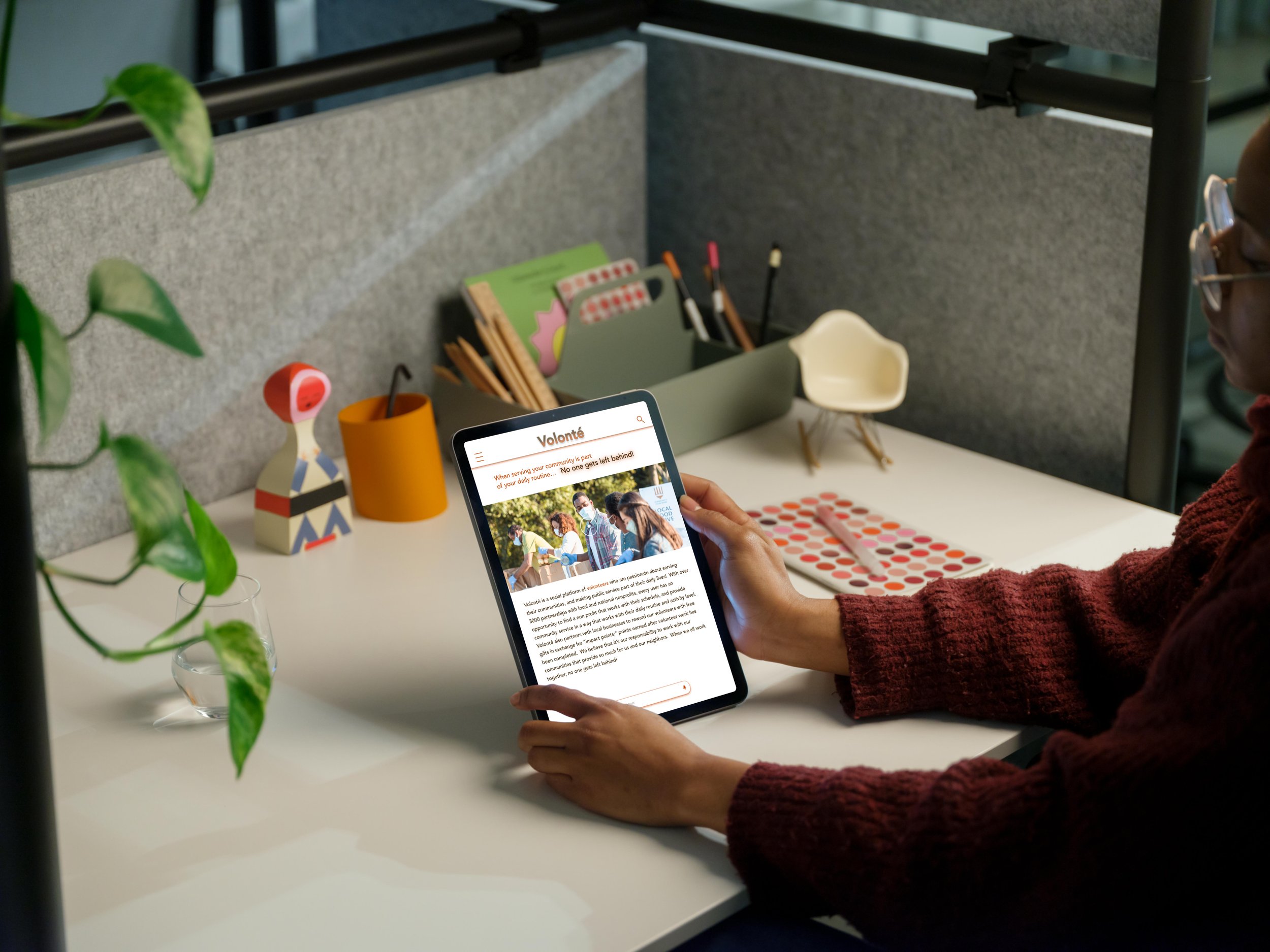
The main objective of a responsive website is to provide information about the app and guide users towards engaging with it, either through the app itself or the website, depending on their accessibility and usability preferences.
In terms of the website's information architecture, the volunteering screen is designed as a secondary page that links from the main homescreen, in contrast to its central-focused position on the app, the feature is positioned more towards the edges. The homescreen serves as the primary point of entry for users seeking information on the site. This hierarchy ensures that users can easily access volunteering-related content while navigating through the site's main sections.
-
The primary aim of the website design is to ensure that users feel confident they have arrived at the correct destination, which serves as the central hub for fulfilling their desired goals and objectives on the app.
In addition to its primary purpose, the website also aims to educate users about different activities within the app. This includes providing information on social media features, impact points, and other relevant topics. The intention behind this is to offer users a clear understanding of why these activities exist and their significance within the app ecosystem. Its primary objective is to inspire nonprofit organizations to prioritize community engagement by highlighting the numerous benefits associated with it.
We’re just getting started
Let’s learn together
-
This website design is primarily intended to provide information and encourage user engagement. In addition, it also serves as a platform where users can access relevant content, learn about products or services, and interact with the brand. On the other hand, my app design is solely focused on enhancing user engagement. It aims to offer a seamless and personalized experience for users by providing specific features or functionalities that are tailored to their needs. While both platforms serve different purposes, they work together to create a comprehensive digital presence for businesses or organizations.
Impact - These designs cleverly merge the use of social media and our current cultural fascination with sharing our daily lives online. They also encourage community engagement and promote social awareness.
Working on this project not only allowed me to enhance my knowledge and experience in design, but it also enabled me to identify and connect the underlying ties between technology and empathy. Through this experience, I gained a deeper understanding of how these two concepts can come together harmoniously. Among all the projects I have been involved in, Volonte holds a special place as my favorite. It has not only enhanced my skills but has also fostered a profound sense of compassion for humanity. I am eagerly looking forward to expanding my portfolio with more projects that align with these values and further ignite my passion for making a positive impact on society.
-
~Implement more accessibility features like text-to-speech, language, and hands-free ordering through a microphone.
~Conduct additional usability studies, and/or app surveys, and implement the feedback.
~Add “check-in” QR code feature
~Add social media engagement page and expand Volonte stories

