
mobile application

Project Overview
-
Saludos Taco Shop is a mobile app that simplifies the process of ordering food. With its user-friendly interface, customers can easily browse through various food options, make selections, customize their orders, and place them. The app utilizes intuitive icons and drop-down menus to ensure a seamless navigation experience for users. The app offers a range of features that are designed to incentivize users to engage with it. These include a rewards page, GPS navigation (currently in the works), and visually appealing elements that make the ordering process more intuitive and enjoyable.
-
April 2022 - November 2022
-
In today's fast-paced world, it can be challenging to find healthy fast food options that cater to specific dietary restrictions. Our users were seeking a convenient solution that could offer them a quick, hassle-free way to locate affordable and nutritious fast food while also ensuring efficient ordering, pickup, or delivery processes.
-
Users of the Saludos Taco Shop mobile app can filter meals based on calories and price, and they can customize according to their specific dietary needs, making this an attractive option for health-conscious and money-conscious taco lovers. In order to gauge the app's effectiveness, we will track how many users customize their meals, make price-based choices, and place orders.
-
UX Researcher & Designer responsible for user research, usability study moderator, wireframing, prototyping, and mockups from concept to completion.
Empathize Phase

User Research
-
After conducting a screener survey with a representative sample of 5-8 diverse users, who frequently order fast food for themselves and their families, I used the results to clearly define their collective pain points. Based on the challenges identified in the users' answers, I was able to conclude that users had difficulty ordering food via apps or mobile websites, and many of them preferred to order in person or over the phone. In addition, many of them expressed that they didn't have any interest in downloading another application to their device, especially if the app didn't provide any additional features to incentivize their engagement. To fix this problem and create a more user-friendly experience, I set out to develop a prototype where users can easily place orders from their devices, in addition to receiving incentives to use the application again. After creating digital wireframes, and a low-fidelity prototype, I conducted a usability study to help me understand the effectiveness of my product's UI, in addition to understanding the overall user experience. By using the data from my usability study, I was able to reiterate my designs and create mockups that can assist users with ordering food.
-
~Price - As food prices continued to climb, users told me they considered cost when choosing a fast food meal for their families. To appeal to as many customers as possible, I priced the items on my app so that most people could afford them. The app is designed for fast food and not high-end dining.
~Heatlth - Users had difficulty finding food products that met their dietary restrictions and healthy eating habits. I wanted to provide users with a way to customize the products they found. I wanted the app to include buttons, drop downs, and toggles equipped to customize the product to the users’ needs.
~Usability - The users said that they found most food apps difficult to navigate and that the space they took up was disproportionate to their usefulness. Many said that they’d prefer to order in person, while some mentioned wanting an app with a simple interface. This app needed to be easy to navigate and read, as well as take up limited storage.
~Device Storage - The users said that downloading food apps took up too much storage on their devices. They didn’t want to download an app if they weren’t going to order from it on a frequent basis. As an incentive to download the app, they wanted the ability to earn rewards so that using the app is justified.
-
Devyn Stacy represents the busy adult who wants to find something to eat after a long day of work. Devyn can also represent a parent with a child who is a “picky eater” and needs food customization.
-
The purpose of my journey map was to empathize with the users before, during, and after using this product, by assuming how they would feel in certain scenarios. Stating these hypothetical issues allowed me to ideate possible solutions for each frustration.
Define Phase


starting the design
-
Before creating digital wireframes for my low-fidelity prototype, I had to decide on the user interface for the design. I sketched various iterations of the same pages to see what would make sense to the broadest audience in terms of usability and aesthetics. I went through and drew a little star by the choices I wanted to go with.
-
~I wanted my screens to be simple and straightforward, with icons that were easily and intuitively recognizable and prompts that guided the user through the food ordering process
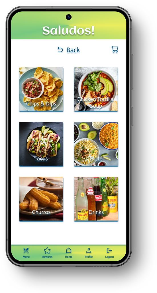
~My first iteration of the menu was each menu item on one vertical scrolling page. I wanted the visuals to showcase the food item being sold while using enticing visuals in order for the user to want to engage with the product. While each image serves as a tempting visual, they also serve as a button that functions to take the users to the next step of the process. In addition, I included text in front of each button for accessibility and a more efficient user experience.
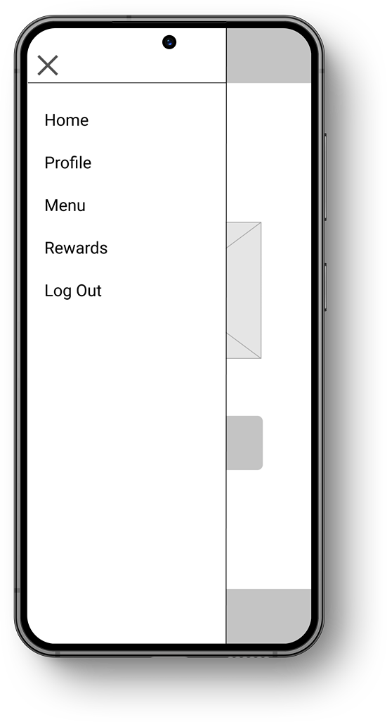
~My first iteration also had a hamburger menu icon that brought in a menu from the left side. This was an intuitive design selected for usability.
-
Please find Saludos’ low-fidelity prototype with open usability around the app here.
Ideate & Design Phase


Testing and redefining the design
-
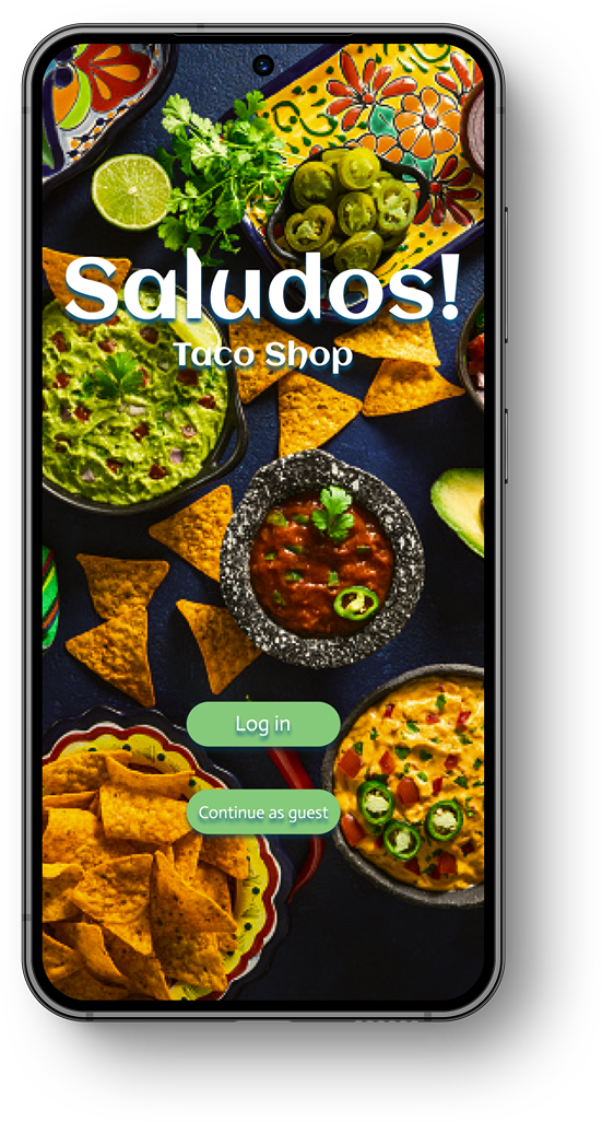
~The user interface needed to look clean and visually appealing, but also allow for easy navigation. For the welcome page, I decreased the size of the mobile buttons in order to follow scalability guidelines, and I changed the logo image that was centered on the interface, to a background image that takes up the entire interface. In addition, I made a “guest checkout” option, should users not want to sign up for an account.
~I deleted the hamburger menu and implemented a footer menu for easier accessibility and user guidance. I also spaced out the crowded text and icons. I simplified the interface to include only the necessary information, and to highlight the rewards feature for consistent engagement with the product.
-
Please find a high fidelity prototype of the ordering experience for Saludos Taco Shop here. Try the carne asada tacos! They’re amazing! And don’t forget to use your rewards points when checkout out, using your credit card! (wink)
-
~The blue text on a white background was an accessibility choice made for legibility, as well as the white text on green buttons. I wanted the color contrast to be present in the design.
~The app includes text throughout the whole user experience, from login to order completion. No icon is left without an accompanying lexicon.
~I will encrypt the app with speech so that users with limited eyesight can still use the product. In addition, I intend to translate the app into Spanish.
Testing Phase

Before Usability Study
After Usability Study

Before Usability Study
After Usability Study

Mockups
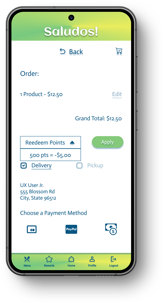
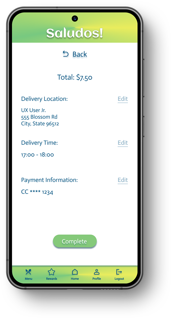
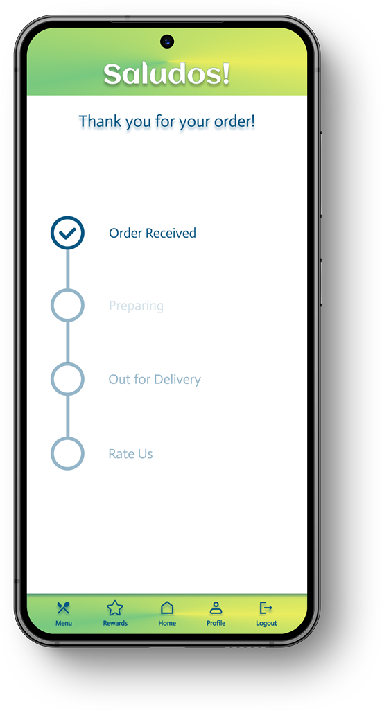
Main user flow to order food


Let’s learn together
-
~Impact - Ordering food can be a strenuous process left to the busiest in the household. Designing an easy-to-use mobile app, with features intended for engagement, is helpful to users who lack the time or money to have a full sit-down meal experience. This app can be used for taco trucks, fast food restaurants, and even personal food sales.
~What I’ve Learned - What I learned is that time IS money, and if we can save our users both, this app WILL be a success.
-
~Implement more accessibility features like text-to-speech, language, and hands-free ordering through a microphone.
~Conduct additional usability studies, and/or app surveys, and implement the feedback.
~Add a GPS navigation feature so that users can find service providers in real-time.


